Prologue
About us
We (Agathe Vukelic, Claire Bilat, Florence Diener and Gaëtan Michelet) are four students who decided to complete a master’s degree in Digital Investigation and Identification at University of Lausanne. As part of this, we found ourselves trying to make a success of an EPFL course intituled “Applied Data Analysis”. We were asked to developp a project under the theme data science for social good. A variety of datasets were provided by the course’s organisators including the Chicago Food Inspections Database, which we selected for our project. However, as forensic sciences students, we could not miss the opportunity to make everything about criminology, which ultimately led to this study. We indeed added a database of the crimes in Chicago in order to analyse the correlation, for a given community area in Chicago, between the number of crimes committed and the hygiene of the food establishments (among other various things).
About the databases used
The first dataset that we used is the Chicago Food Inspections Database linked above and provided by the Chicago department of Public Health’s Food Protection Program. It contains informations regarding the inspection reports of food establishments in Chicago from 2010 to the present. Some informations are directly linked to the establishments like their exact location, their type (restaurants, coffee shop, …) or their license number. Some other informations document the inspections realized like their result (pass, fail, …) or the violations noticed.
The second dataset used for this project is the Crimes in Chicago Database also linked above and provided by the Chicago Police Department’s Citizen Law Enforcement Analysis and Reporting. It contains informations regarding the reported incidents of crime that occured in Chicago from 2001 to present, like the primary type of the crime (homicide, burglary…) or its anonymized location.
The third dataset used for this projet is the Chicago Business Licenses and Owners Database provided by the City of Chicago. It contains informations about the owners of establishments in Chicago and allowed us to link the food establishments of the first dataset to their respective owners.
The fourth and last dataset used for this project is the Geographic Boundaries of Community Areas in Chicago Database provided by the City of Chicago. This dataset allowed us to link the food establishments of the first dataset to their respective community areas.
About this project
Research questions
The main research question was : where to eat safely in Chicago ?
The adjective safely has been chosen wisely because it has multiple meanings: you can eat in a safe way making sure that the establishment where you go respects particular hygiene rules, but also that the place is safe according to the crime rate of its district. That said, two scores has been computed per community area : their hygiene score based on the food inspections performed in the area and their crime score based on the incidents of crime reported in the area. More about the exact calculation of those two scores will be explained later.
It has been decided that additionally to the geographic component of the analysis (based on the geographic delimitations of the community areas) a temporal component would be taken into account. Indeed, the field of restoration is known to be in a constant evolution : each year, many establishments are opening while other are closing or changing of owner - especially in big cities. This is why the different calculations and comparisons has been done by year. Also, the main research question (where to eat safely in Chicago) has been given based on the latest data, considering that it would be the most useful.
It has also been decided to distribute the facility types into facility groups that fall into two main categories :
- The private establishments, where it is possible to eat a main course (for example, the places where you can only eat an ice cream were deleted of our list)
- The public establishments like school cafeterias and hospitals
More about the exact distribution of those Facility Groups will be explained later.
Some other research questions were added to the project :
- About the
HygieneScores:- Are they significant differences of Hygiene Scores between the community areas ?
- How is the evolution over time ?
- Which group of facilities has better hygiene score ?
- Are they significant differences of Hygiene scores between the private and the public establishments ?
- About the management of food establishments :
- Is there a relation between the number of establishments that an owner has and the hygiene scores obtained ?
Preprocessing
This part of our project is not the most thrilling so we will not go over every detail of the preprocessing but only mention a few ones that could maybe help the reader to gain a better global comprehension of the project. Please refer to our project notebook if you have an insatiable curiosity about it.
The Chicago Food Inspections Database
The Facility group
The Database contains informations about the facility type of the establishments inspected but there were too many different types of facility for the purpose of our project. As explained before, we created two main categories, private and public establishments, containing a few custom facility groups into which the facility types of interest are distributed. Those facility groups are listed below.
private facility groups : - restaurant - grocery restaurant - banquet - rooftop restaurant - bar restaurant - bakery restaurant - liquor restaurant - catering - golden diner
public facility groups : - day care - school - childrens services - adulte care
The Hygiene score
In order to compute the hygiene score of a community area, we first computed the hygiene score of an inspection. To do so, we took into account the inspection’s result and the number of violations detected during the inspection. There is three main possible outcomes of an inspection : either the facility passes the inspection or it passes with conditions or it fails. We attributed an arbitrary score to each of those outcomes :
- Pass = 1
- Pass with conditions = 2
- Fail = 3
The formula used to compute the hygiene score of an inspection is the following :

We gave much more weight to the result of the inspection because there are some violations more serious than others which can cause some biais : an establishment could fail its inspection by violating only one serious hygiene rule and another establishment could pass its inspection (with conditions) by violating two or more less serious hygiene rules.
The hygiene score of an establishment, per year is defined by the mean of the hygiene scores from every inspections performed within the year in the particular establishment.
The hygiene score of a community area, per year is defined by the mean of the hygiene scores from every inspections that took place within the year in the particular area.
We took the mean and not the sum because the distribution of inspections within the different community areas is not homogen and we could not assume that the ratio between inspected and uninspected establishments is the same for each community area.
Limits : An important point is to pay attention to the number of inspected establishments compared to the total number of establishments. It is certain than the variations of this ratio between the community areas has an impact on the results.
The Crimes in Chicago Database
The Crime score
In order to compute the crime score of a community area, we first computed the crime score of a reporterd crime. To do so, we took into account the crime’s minimum sentence (in term of years of imprisonment) provided by the Illinois Penalty Code. For the crimes where the minimum sentence is not imprisonment, we fixed the crime score to 0,1.
The crime score of a community area, per year is defined by the sum of the crime scores from every crimes reported within the year in the particular area.
Here we took the sum because we assumed that there was no huge difference between the ratios of reported vs unreported crimes for each community area.
Results and discussion
HygieneScores / Community Area
General Visualization
The following figure allows to visualize the HygieneScores per Year for each Community Area. The Mean line helps to see the bars tending to deviate from the Median computed.
unselect the years you don’t want to display by clicking on their label on the right
We can see that there is no particular trend, with a Median oscillating between about 30 and 60, except for on entry, which is really above the rest, for the 47th Community Area with a Median at 4. This community area has low HygieneScores, exception made of 2013.
Visualization Year By Year
The following figure allows a visualization of the results in another way - each bar contains all the HygieneScores of the Community Areas.
Zooming in, we can notice again that the repartition for each Year seems to be random.
We also have plotted the HygieneScores in descending order, to see if we could learn something from it but neither the top 10 nor the bottom 10 are alike, except for the 47th Community Area which stays at the top 1 - getting the lowest scores so the best results.
Now let’s have a look at the map of Chicago, in order to have a geospatial view of the results.
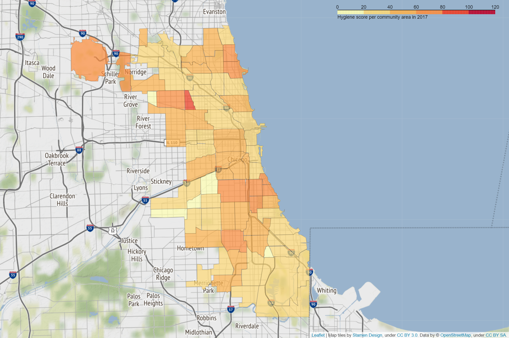
As well as we saw on the figure 1.1 and 1.2, the HygieneScore doesn’t seem to follow any rule relative to the Community Areas. The maps for the other years - 2011, 2012, 2013, 2014, 2015, 2016 and 2017 - are showing the exact same absence of trend which ends up being a particular trend.
Correlation
The .corr() function gives the Pearson Coefficient between the HygieneScores and the Community Areas.
The result of the correlation computation is in accordance with the rest of the analysis : there is indeed no relation between the HygieneScore and the Community Areas.
Considering the constant variations in the food domain, the results obtained could simply indicated that the inspections are fair, following the phenomenon of changes, unpredictable due to the behaviors in the restauration industry.
N.B. : The results observed for Burnside, the 47th Community Area, can be explained with the White Flight phenomenon, leading the businesses to move away, but also with the geographical situation on the border of the city, which leads Burnside to be more a “comfortable residential community”. Source : wikipedia
The low HygieneScores could either be explained by a small number of establishments with correct HygieneScores running in a zone whose comfort could ease the maintenance of the establishments.
HygieneScores / Facility Type
The data also give the Facility Type of each establishments. As explained at the begining of our story, they have been put into groups in order to obtain meaningful results.
On this figure, we can study the differences between Public and Private establishments.
Again no particular trend can be observed for the Public establishments, except for the category Restaurant which happens to have minimized variations until 2018 where the rise of the HygieneScores is huge. The Restaurant type of facility is the one with the more entries in the dataset.
For the Private establishments, we can say that the HygieneScores are more stable. They seems to follow the same trend, with a rise in 2018 and 2019.
The Private establishements are the more sensitive. Because of the way they works - children or elderly are in their care and those care are often expensive - they generally have to follow specific rules. Their particular duty could explain the fact that their results are more constant than the ones of the Public establishments.
HygieneScores / Owner
We thought that it would be interesting to calculate the Pearson Coefficient between the HygieneScores and the Number of Restaurants by Owner. Using the .corr() function, we obtained the result : PCC = -0.29536601012489433
The HygieneScores and the Number of Restaurants by Owner are not correlated following the Pearson method.
The result obtained is contrary to our thinking : we thought that the more establishments a owner has, the more able he is to enforce rules fitting the Food Code - owning several establishements would induce more experiment and resources. Apparently, this is not the case !
CrimeScores / Community Area
General Visualization
The following figure the visualization of the CrimeScores per Year for each Community Area.
unselect the years you don’t want to display by clicking on their label on the right
This figure allows to see in details the CrimeScores of each Community Area.
We can already see that the CrimeScore are very different inter-Community Areas, but stay in the same ranges intra-Community Areas. Mostly, the CrimeScores have decreased between 2010 and 2015, then have rised in 2016.
Now let’s take a look at the city map for another point of view.
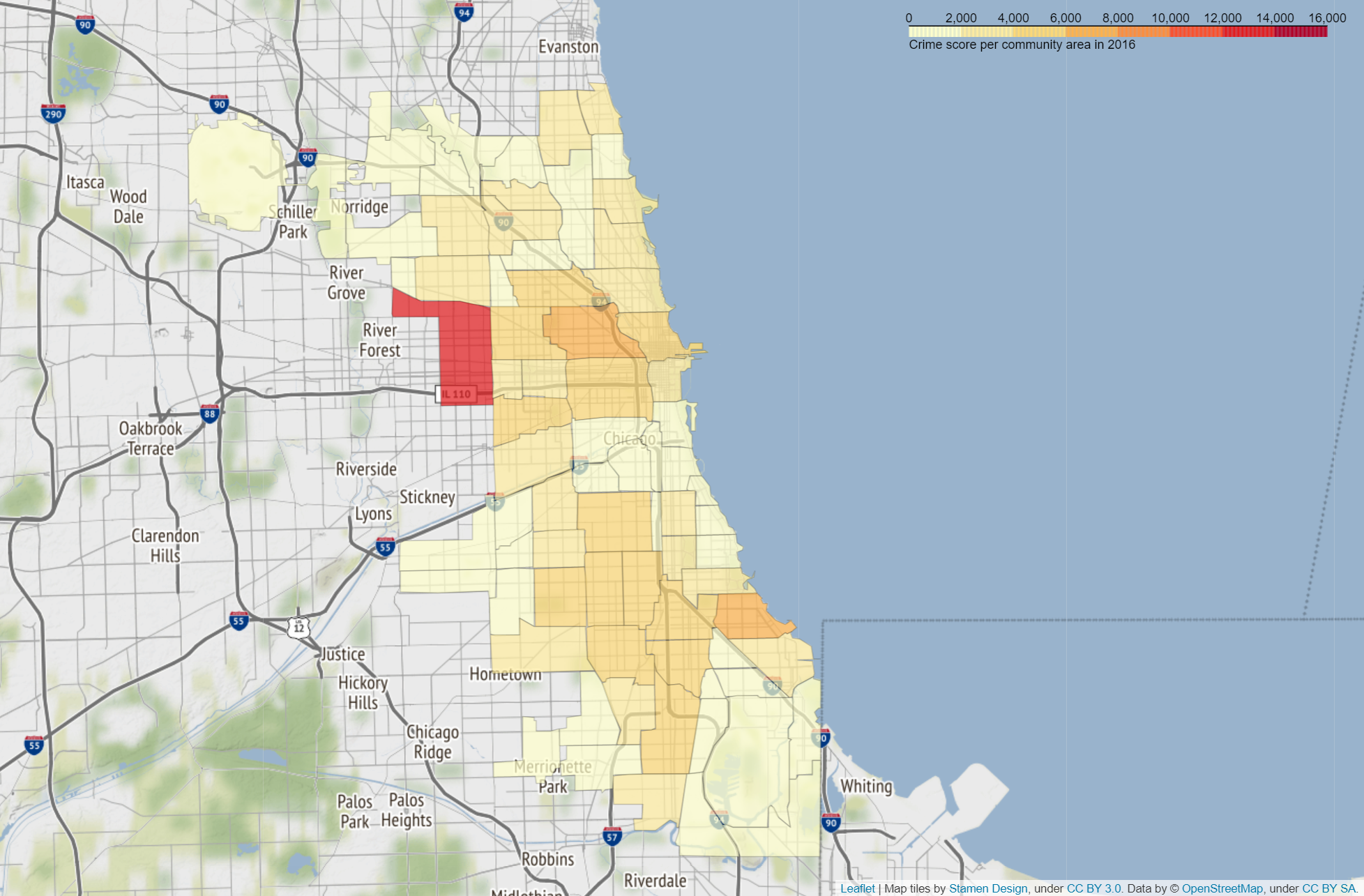
As we can see from the map, the crime score stays more or less stable with a slight decrease from 2010 to 2015. In 2017, as on the figure 4.1, we can observe very low crime scores everywhere. As we read nothing that could explain this, we think it is an issue in the dataset, maybe a non-complet dataset for this year.
We can also see that one community area particularly stands out every year (except 2017) : Austin. Getting information on this community area we find it is one of the most populated community area and that there is in Austin a lot of violent crimes. That explains the high crime score that it gets as crimes scores are calculated based on the penalty of the crimes.
Considering the previous results in the HygieneScores sections, this rise cannot be explain by our analysis of the Chicago Food Inspections yet, but it already has been discussed. Quickly searching on Google, many articles relate this trend :
“The city’s overall crime rate, especially the violent crime rate, is higher than the US average. Chicago was responsible for nearly half of 2016’s increase in homicides in the US, though the nation’s crime rates remain near historic lows. The reasons for the higher numbers in Chicago remain unclear.” - Source : wikipedia
Apparently, their analysis of the Chicago Food Inspections could not have explained it either.
This figure allows a good visualization of the fact that there is a general trend in which the CrimeScores varie linearly by CommunityArea.
Correlation
The corr function gives the Pearson Coefficient between the CrimeScores and the Community Areas.
The CrimeScore appears to be very related to the place.
Hygiene versus Crime
Correlation
The difference of the trends detected between HygieneScores and CrimeScores strongly lead to think that there is no correlation between the two. Using the .corr() function, we obtained the result : PCC = -0.3059226707490215
The CrimeScore and the HygieneScore are not correlated following the Pearson method. In our opinion, this result is a very good point :
-
Even if in some Community Areas the CrimeScore and therefore the level of criminality is very high, it doesn’t impact the food establishments of the place
-
The Chicago department of Public Health’s Food Protection Program works the same way no matter the Community Area : it is generallly not the fault of the people who want to run food establishments if the criminiality level is high, so they should not be penalized by it.
To end the story, we would like to warn you about the fact that if some Community Areas are more affected by the criminality than others, the criminality itself strongly depends on the people involved in the crimes - autors, victimes. Without solid data analysis of the actors of the crimes, we cannot tell you that you would not be safe in certain Community Areas according to your profil.